Living Room
Caroline deVlaming Farrior
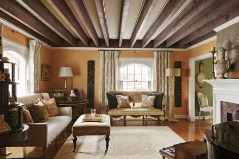
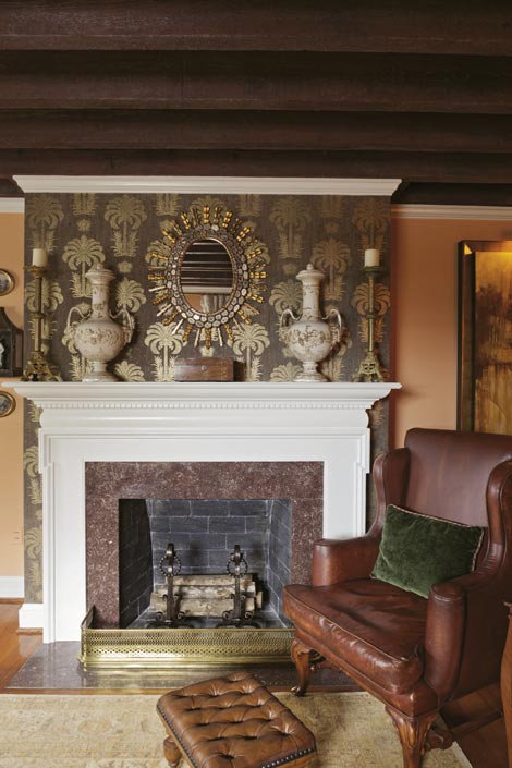
“The dark beams and low ceiling inspired me to go with a handsome, cozy look that played off the 1800s period of the former warehouse,” says Caroline deVlaming Farrior. She used Benjamin Moore “Toffee Orange” paint “to give a warm glow almost like candlelight and make a nice backdrop for light draperies and dark wood furnishings.” For a bright accent, Farrior surrounded the mantel with gold-leaf cork wallpaper and added a gilt mirror, repeating the metallic touches in a second mirror and the draperies.
Mix & Match: Farrior mingled period antiques with furnishings that “reference the past” for a room that’s utterly livable.
deVlaming Design Inc.
(843) 270-5200

Foyer, Stairwell, & Upper Hall
Roberta Ketchin
Tasked with creating guests’ first impression as they entered the home, Roberta Ketchin knew she had to “do something to make everyone stop and say, ‘Wow,’” she notes. She began by painting the foyer, stairwell, and upper hall “Adirondack Green” by Benjamin Moore, explaining that it “keeps your eye in the room and contrasts with the ivory woodwork.” Because the space was small, “it was very important to have larger scale items and for them to be well-chosen.” In the foyer, a round table dressed in green and yellow florals pairs with a dramatic chandelier to create the room’s focal point. For the hallway, Ketchin selected sizable pieces of art that contrast well with the dark wall color.
Mirror Image: “Hanging a large mirror on the wall creates the illusion of depth, making the room feel wider,” says Ketchin.
Ketchin Interiors
(843) 532-0628
Dining Room
Sandra Ericksen
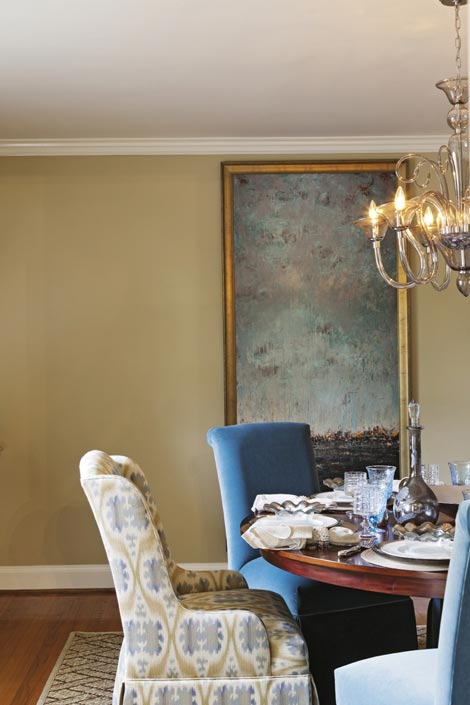
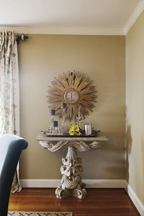
Formal, sure. But stuffy—not a chance. Sandra Ericksen created a sense of relaxed elegance in this dining room, with a seagrass rug setting a casual stage for a carved mahogany table laid with Annieglass from Vieuxtemps. Four slipper chairs upholstered in blue velvet, plus two wingbacks in complementary ikat (both fabrics are by Kravet), invite guests to settle in. Art by John Beard and Dee Beard Dean was a key design element, drawing the viewer’s eye up to give the impression of a higher ceiling and offering beautiful views to enjoy during leisurely meals.
Color Cue: Ericksen used Benjamin Moore’s “Bennington Gray” wall paint. “Beige with a tinge of grey, it has depth and is quiet without being boring,” she says.
Sandra Ericksen Design
(843) 324-5914
www.sandraericksen.com


Gentleman's Study
Sandra Gaylord
The one thing standing between Sandra Gaylord and the gentleman’s study she envisioned? A whole lot of dark wood paneling. It lined the walls and backed a pair of tall bookshelves—and couldn’t be painted or damaged. Hardwood floors didn’t help matters.
Deciding to disguise what she could, Gaylord painted the bookcases a bright blue, then covered the paneling behind them in Lacefield Designs’ “Zebra Ikat” fabric in “Marina” for more visual drama. Neutrally hued linen curtains dress the windows (and conceal some paneling) while a flokati rug separates the lounge area—outfitted with a pair of studio chairs—from the drafting table work space. “In the end, the paneling became a highlight of the space, but not the focal point,” says the designer.
Tip: “When you have a challenge in a room, identify all the things that make it a problem. Then ask yourself how they can be solved,” advises Gaylord. “When you create a solution, you begin to create the design.”
Gaylord Design, LLC
(843) 327-4635
www.gaylorddesignllc.com
Guest Bedroom
Julianne Vadas
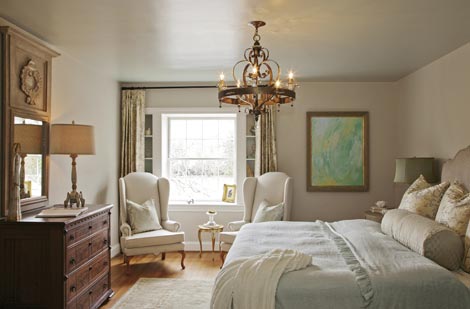
Taking cues from the natural surroundings—Charleston Harbor and a lush park—Julianne Vadas turned this guest room into a soft, quiet sanctuary. Skirted side tables and an upholstered bed “are designed to feel cozy and genteel,” says the designer, who turned up the luxury with ultra-soft bedding, including a washed linen duvet. She used semi-gloss “Sea Salt” paint by Benjamin Moore to add color to the ceiling and window cubbies, but kept wall art to a minimum. “This gives a feeling of relaxation without too many distractions” and puts focus on a painting by Cara Applegate.
Balanced Act: “Combining skirted pieces, floor-length window treatments, and soft fabrics with hardwood brought balance to the space,” says Vadas.
Simply Stated Designs, LLC
(843) 364-9559
www.simplystateddesignsllc.com
Artist's Studio
Angie Artigues
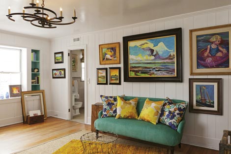
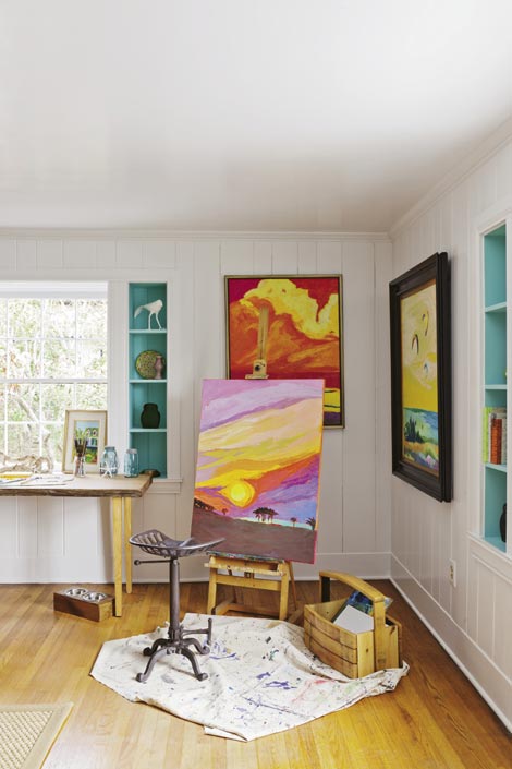
Alove of rich, vibrant paintings like those of local artist Carol McGill inspired Angie Artigues to create a colorful artist’s studio. She transformed the once-dark room by painting the wood paneling and ceiling a high-gloss white to reflect light streaming in through the harbor-facing windows. The hue is a crisp backdrop for coastal-inspired pieces by McGill, which “have a modern, almost abstract quality that I love,” says Artigues.
During several years living in New York City, the designer had seen plenty of warehouse transformations in SoHo and the West Village. “These led me to bring in elements such as the rustic work table by local artisan Guyton Ash of Ash Woodworking and vintage accents like an industrial tractor stool,” she explains. “I like the juxtaposition of the rustic painted walls and iron pieces with modern fabrics and upholstered furnishings.”
Gallery Rules: “When creating a gallery wall, take into account any furnishings that will be placed on the wall,” says Artigues. “The height of a table might serve as a reference for where to place art on the opposite side.”
Eye for it, LLC
(843) 303-3694
Master Bedroom Retreat
Angie Artigues & Michelle Still
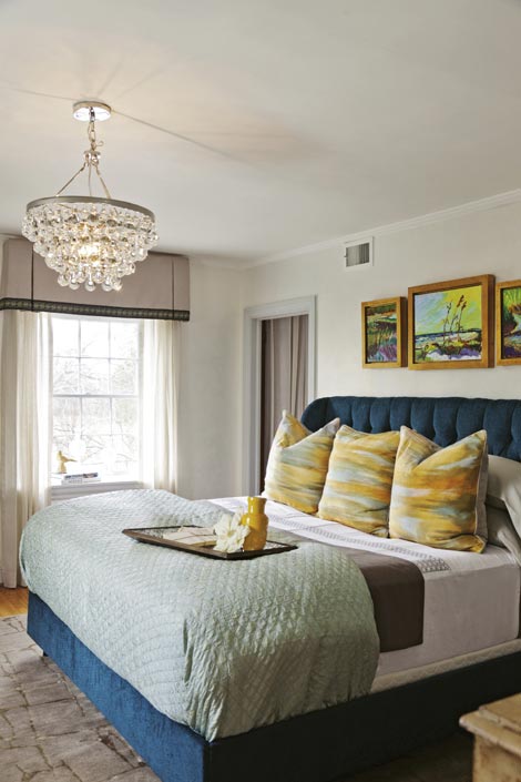
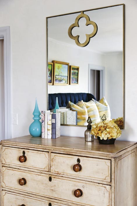
Ashimmery wall finish, grey silk area rug, and mix of classic and modern furnishings turned a square room with little architectural interest into a restful retreat, says Angie Artigues. Along with Michelle Still, an interior designer with CHD Interiors, she conjured a “sunrise/sunset” color palette. Suzanne Allen of Wall Candy, Inc., painted the walls in a faux finish that reads blue in one light and gold in another, “giving the room a warm glow,” notes Artigues. The designers dreamed up a bed upholstered in Fabricut chenille and added Euro pillows in a Telafina silk “that looks like a watercolor painting.”
Get Inspired: “I always look at a room and say to myself, ‘If I could do anything, I would....’ Then I start doing it!” says Artigues.
Angie Artigues, Eye for it, LLC, (843) 303-3694
Michelle Still, CHD Interiors, (843) 571-2446, www.chdinteriors.com
Lady's Retreat
Maria Crumley Schendzelos
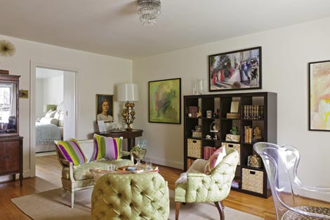
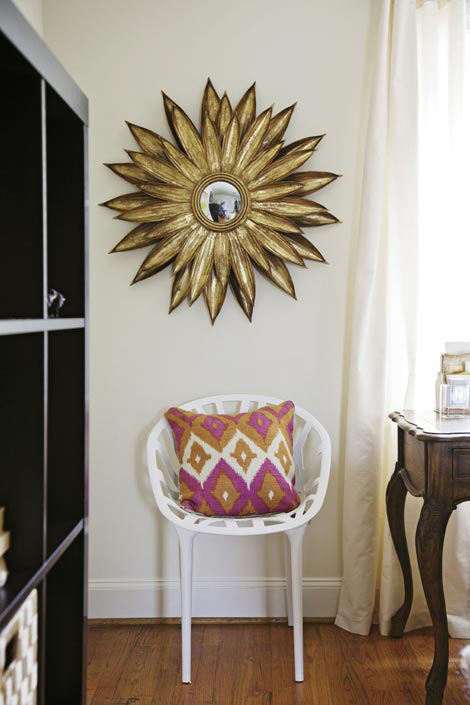
Desiring to create a space where the lady of the house could both work and relax, Maria Crumley Schendzelos transformed a closet of this upstairs room into an efficient work station, then created a serene but colorful seating area. “I used pairs of items—chairs, mirrors, and art. The symmetry gives a balanced, calm feeling,” Schendzelos explains.
Brighter Idea: “If your room does not get much natural light, use a light wall color,” says Schendzelos. “I painted the walls, trim, and ceiling ‘Arcadia White’ by Benjamin Moore.”
Maria Schendzelos Design
(843) 452-9017
www.mariaschendzelosdesign.com

Courtyard & Exterior
Kimberly Crane
Lush, colorful plantings give this house serious curb (and courtyard) appeal. Landscape designer Kimberly Crane flanked the front entrance with containers bearing blue point juniper trees under-planted with asparagus ferns, geraniums, and osteospermum daisies (see page 89)—all plants that can withstand full sun, wind, and salty air. In the back courtyard (shown at right), which was the backdrop for the Showhouse’s cafe, Crane played up the moss growing on brick walls and walkways by adding a similar variety into planters filled with ferns and tropical houseplants such as red cyclamen, ivy, creeping Jenny, and bird of paradise.
Don’t Forget: Tropical houseplants can also do well in low-light outdoor locations.
EarthArt
(843) 364-4903
www.earthartdesign.net