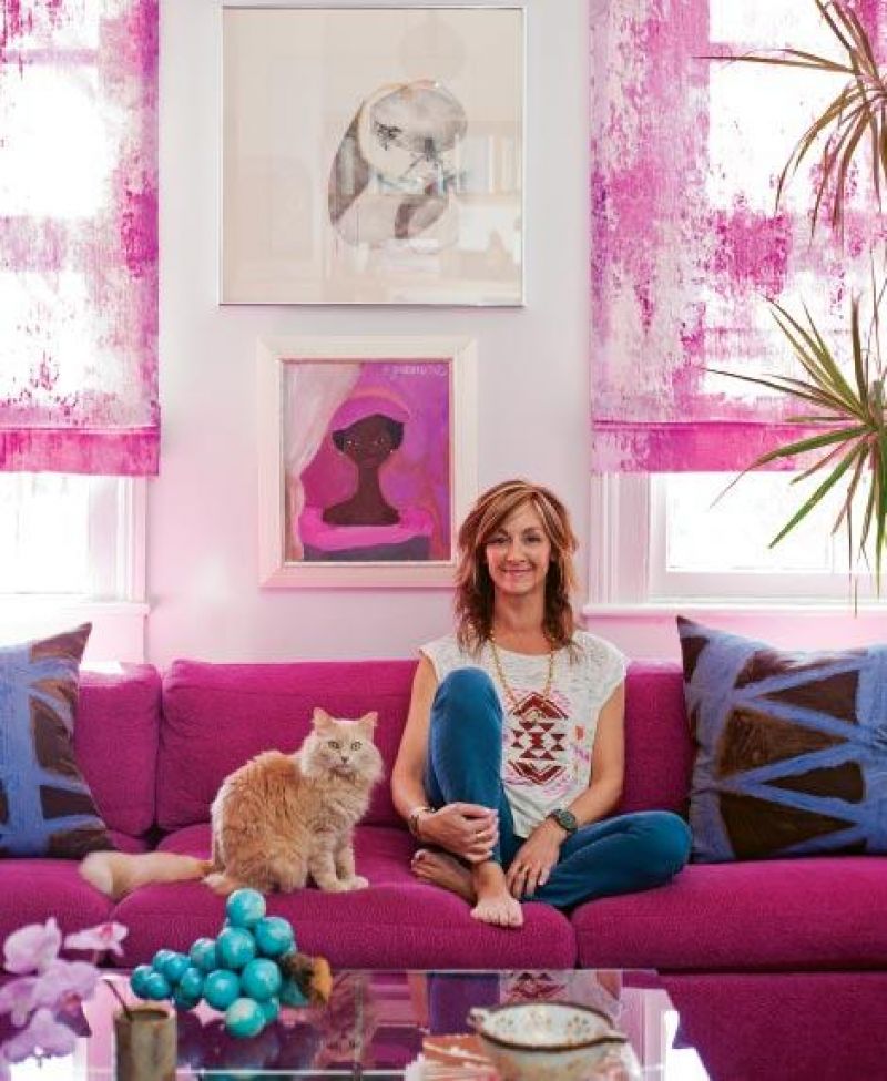


Angie Hranowsky isn’t really a beige kind of gal. Hot pink, sure, and plum works, too, but a house full of safe and surefire neutrals without a healthy dose of daring, a punch of the unexpected? That’s never been her thing. The trailblazing interior designer, known for her pre-Mad Men penchant for mid-mod style and brave (if unlikely) fabric and color pairings, was hailed as one of Southern Living’s “New Tastemakers” just last year, and her work has splashed shelter pubs ranging from Lonny to Metropolitan Home several times over.
And yet, the “uniformly pale, beige” rooms in her new apartment—a two-bedroom single on Bull Street—were a big-time score.
Because rather than seeing bland, Angie saw a blank slate—one part cozy domicile for her and her two young children (Loulou, 11, and Sasha, seven), one part fiercely creative design lab.
“This was that rare project that I get to do for myself, so every color—every idea—was on the table. I was ready to mix paints, try new palettes, and be free to make mistakes,” she says.
Her biggest concern in this leap from somewhat suburban neighborhoods (first in Avondale, then Riverland Terrace) to downtown dwelling was installing a sense of permanence. “Apartments can feel chopped up and disconnected or worse, impersonal. This needed to feel like our house,” says Angie.
There were a half-dozen quirks here and there (i.e., walls had awkward alcoves thanks to fireplaces and odd piping, the galley kitchen was sectioned off by a partial divider), but it was a fairly straightforward challenge: two rooms apiece on the first floor and second, plus a center hall and two tiny bathrooms.
For Angie, solutions were everywhere—floor to ceiling, upstairs and down. Here’s how she switched this standard-issue single into a haven of high design and family-friendly comfort.
She Invested in Game Changers
For Angie, these were paint and light fixtures—switching up these elements in each room (hallways, too) gave the house a starting point that was more her style.
Though swapping out basic light fixtures in a rental is always a fast face-lift, Angie chose chandeliers and pendants that were more than just upgrades. She ushered in statement pieces like a 1960s Verner Panton chrome disco chandelier in the hall and a trio of vintage globe pendants in the living room. “The vintage chandeliers add originality and interest juxtaposed against the classic architecture,” says the designer.
The light-reflecting gray paint in the living room and lively purple in the dining room, for example, were similarly precise and purposeful. “I invested time in finding the right colors, mixing and testing until I had what really fit us,” says Angie. Plus, she painted the trim the same color as the walls. “Blending these architectural elements strengthens connectivity within the house, reducing that ‘choppy’ feeling.”
She Created Big Impact
“In the living room, I found this fuchsia cotton woven fabric that I loved,” recalls Angie, and laughs. “I thought, ‘Why can’t I have a hot pink sofa?’”
So a Milo Baughman sectional was re-covered in the vibrant Glant fabric and played up—rather than down—with semi-translucent pink patterned Roman shades. In every room, in fact, window treatments dial up the drama by echoing the colors of either the wall paint or primary pieces of furniture. And in the dining room, a set of four simple Danish dining chairs was re-covered in a bold purple metallic weave a few shades darker than the walls.
She found other ways to go big, too. The four-foot vertical bulletin board behind the dining table has primo placement as a focal point. “It was meant for the kids’ artwork and projects, but when I filled it, it just looked messy,” says Angie. “Then I centered a couple of larger scale framed photos of the kids in the middle and hung artwork around those. This really streamlined it.”
She Didn’t Forget Function
“When I was working on the living room, I had to remember that we don’t have another hangout room, like a den or a sitting room. This is it. It has to be comfortable, it has to be inviting enough for everyday,” Angie says.
She replaced the structured, low-slung sofa from her old house with a cozy sectional and offset a round Baughman chair with a soft, century-old Bergere for stretching out.
This need to square form with function was also the impetus for a clever set of bookshelves along the north wall of the room. “I sketched out a modular system of bookshelves for good-looking storage, but also to optimize a pair of recessed walls,” says Angie, who took her sketch to woodworker Capers Cauthen. “We found some reclaimed pine that was the right thickness, and he built the shelves to be modular, so I can take them with me when I leave.”
In the upstairs bedroom the children share, Angie envisioned streamlined L-shaped beds, leaving plenty of wall space for art and other design ideas. “But Loulou was dead set on the idea of a tall loft bed; we went around and around until finally, it came to me. I thought, ‘Well, it’s her room, why not?’” So up went the six-foot loft towering over Sasha’s bed, and meanwhile, the designer worked with a friend to fashion low bookshelves to fit under the windows. She hung a large-scale painting by P.R. McIntosh from the late ’60s over that, along with a sculptural arrangement of copper cats.
“I always want my spaces to feel warm and interesting and original,” says Angie. “Here, I mixed old favorites with new ideas, and this house fits us. It started out as just what I
needed, and ended up that way, too.”