Taking risks and reaping rewards in a not-so-typical beachhouse

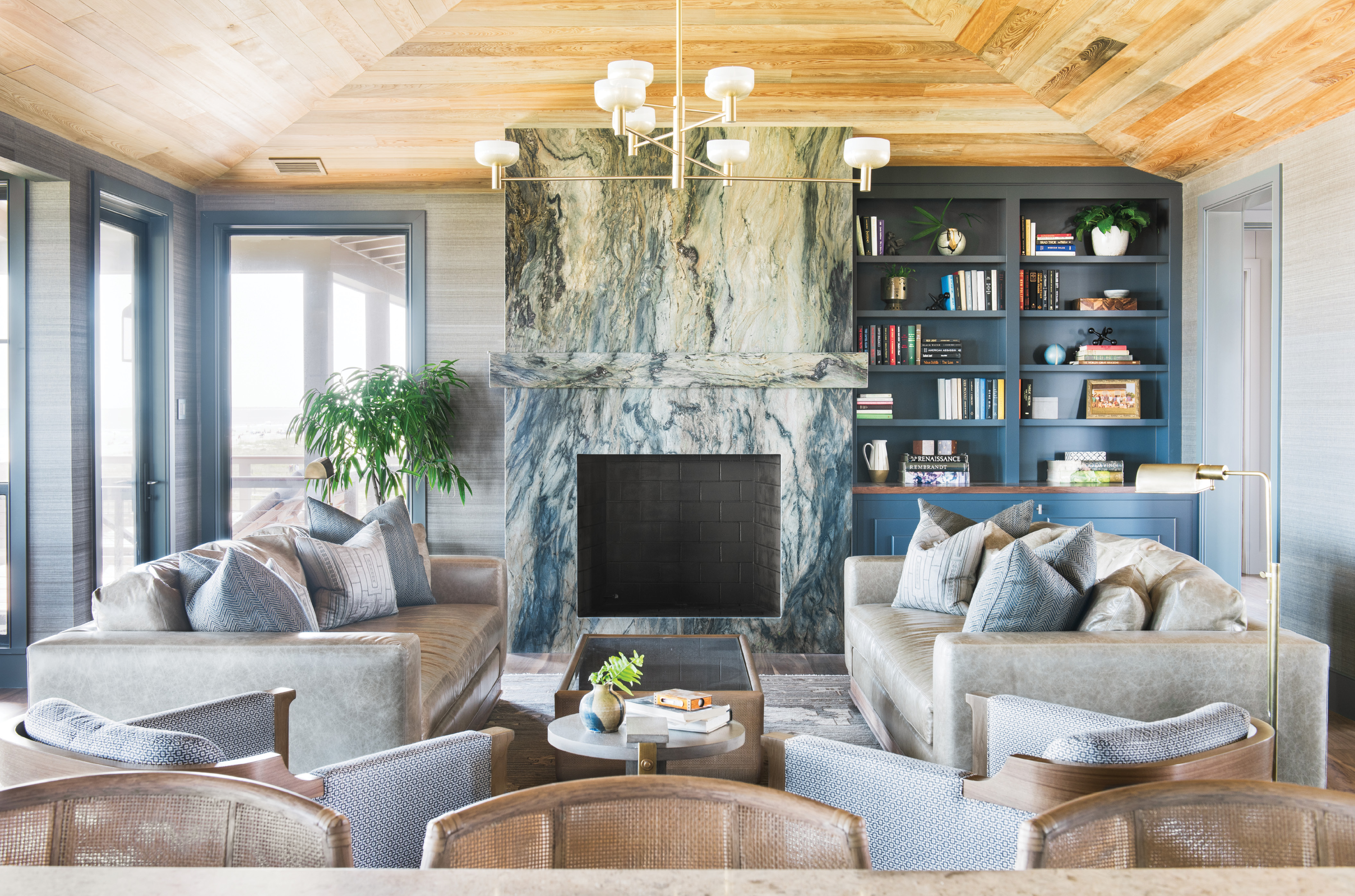
It started with a great slab of rock, a marbled swirl of colors evoking both ocean and earth. Once Joan and Dennis Berger selected that show-stopping granite, auspiciously named “Blue Tides,” for a living-room fireplace, their new Isle of Palms home had its palette—one that would sweep through a place designed to make a statement while complementing its natural, coastal environs.
“The Bergers encouraged us to go bold and supported our approach to take risks,” says interior designer Cortney Bishop. Then Chicago residents, the couple had been spending summers on the island with their children, Megan and Wesley, for some 20 years, even purchasing a second home here in 2009. “We found the ideal, laid-back vibe here,” Joan says. “We’re beach people, and being able to walk or ride a bike along this wide, long beach, or set up an umbrella and spend the whole day—that’s our idea of paradise.”
By 2016, Joan and Dennis’s Illinois nest was empty, and the lure of the sand was strong: they decided to build their full-time “forever home” in the Lowcountry. Luckily, the perfect beachfront property was waiting. Raised slightly above its neighbors, it’s situated at the widest point of the Isle of Palms, where views soar past the Sullivan’s Island Lighthouse to Morris Island.
The Bergers razed the 1960s “concrete bunker” occupying the primo spot and hired architect Beau Clowney to design a home suitable for the couple and their dogs, Dude and Daisy—plus all the friends and family who would visit. They knew they wanted a modern, unconventional beach house, and they were also set on a reverse floor plan, with the main living spaces on the top story. “Why wouldn’t we take the best view?” says Dennis.
Still, “much of what we do is derived from historic examples of traditional vernacular architecture of the coastal islands,” Clowney notes. He created an asymmetrical, 5,000-square-foot shingle-style house that runs straight along the coastline, then wraps around a central courtyard on the west. The main entrance is to the north, on a narrower side street, giving the home a slightly off-kilter aspect that plays into its nautical vibe. “The challenge with an elevated house is working with the roof lines in order to maintain a lower overall profile while still incorporating vaulted ceilings on the interior whenever possible,” says the architect. “While the house is larger, we wanted to the roof lines to somewhat reflect the qualities of a good old beach house.”

With the Tide: Situated on the top floor, the main living space is dominated by a fireplace set in “Blue Tides” granite from AGM Imports. Horsehair grasscloth wallpaper in “Clydesdale” by Phillip Jeffries continues the textural feel evoked by the stone’s veining. Leather sofas from Verellen and Osborne & Little fabric-clad club chairs by Holly Hunt lend warmth and comfort to the scene, illuminated by Cartwright New York’s hand-brushed brass “Otto Luce” chandelier.
The home’s cocoa-caramel exterior was a significant departure from the traditional shore cottage, however. “They wanted something completely different—richer and darker—than any house they’d seen,” explains Bishop. Its brown hues blend into the landscape, seeming to rise from the sand dunes rather than stand out from them, as the neighboring parade of white wooden homes do.
Inside, it’s all about maximizing light—and space. To that end, there’s hardly a corridor to be found; the rooms all run into each other as they do on a sailboat. The bedrooms and private living areas are small, with built-in closets eliminating the need for large, bulky furniture. “Beau doesn’t make huge rooms because he thinks you should all be together in the family room—or outside,” explains Joan.
An elevated, indoor/outdoor patio serves as the centerpiece of the home’s first story as well as a spectacular front entrance. In the winter, the family gathers there for happy hours around the fireplace, its surround paved dramatically in whole oyster shells. “That was a bold move that paid off,” reflects Bishop. “We laid a hand-sculpted Artistic Tile limestone flooring to make the fireplace feel even more special against it—like something kind of magnetic.”
A cozy family room is just through the double doors, with fresh white shiplap walls offsetting an emerald-green linen-upholstered Verellen sectional and warm walnut flooring and accents. “The view was the ocean, so we wanted to keep the house rich and cozy, layered in earth tones,” Bishop says. This gathering area is filled with art collected during the couple’s travels through Europe. For example, a neon sign purchased from God’s Own Junkyard—the oldest sign makers in London—directs guests to the “Lido” (a British term for “swimming pool”).
If you skip a dip and move instead into Dennis’s study, you’ll find a handmade globe from England’s Bellerby & Co., replete with custom-painted illustrations pinpointing the countries the Bergers have visited, the states where they have lived, and even the places where their pooches were born. “I always enjoy coming in here. It’s comfortable and at the same time inspiring,” says Dennis, who uses his tripod-mounted telescope to watch the giant cargo ships roll in from across the sea.
Nearby, in a wing designed for visitors, Clowney transformed what might have been a mere hallway into a wet bar. “Beau really uses all the space,” Dennis marvels. “He created this place where guests can make coffee without having to come up to the kitchen.” In a similar move, Clowney tucked galley-style bunk beds into the entryway of one of the three guest rooms.
A central staircase leads to the top floor, and at its crest, a resin and plaster Kelly Wearstler console frames another neon sign from London—this one advising, “Trust Your Own Madness.” It’s entrée to an open-plan living and kitchen area that continues the colorways from below, beginning in a daring fashion: the dining space is coated floor-to-ceiling in Farrow & Ball’s lead-grey “Down Pipe” paint.

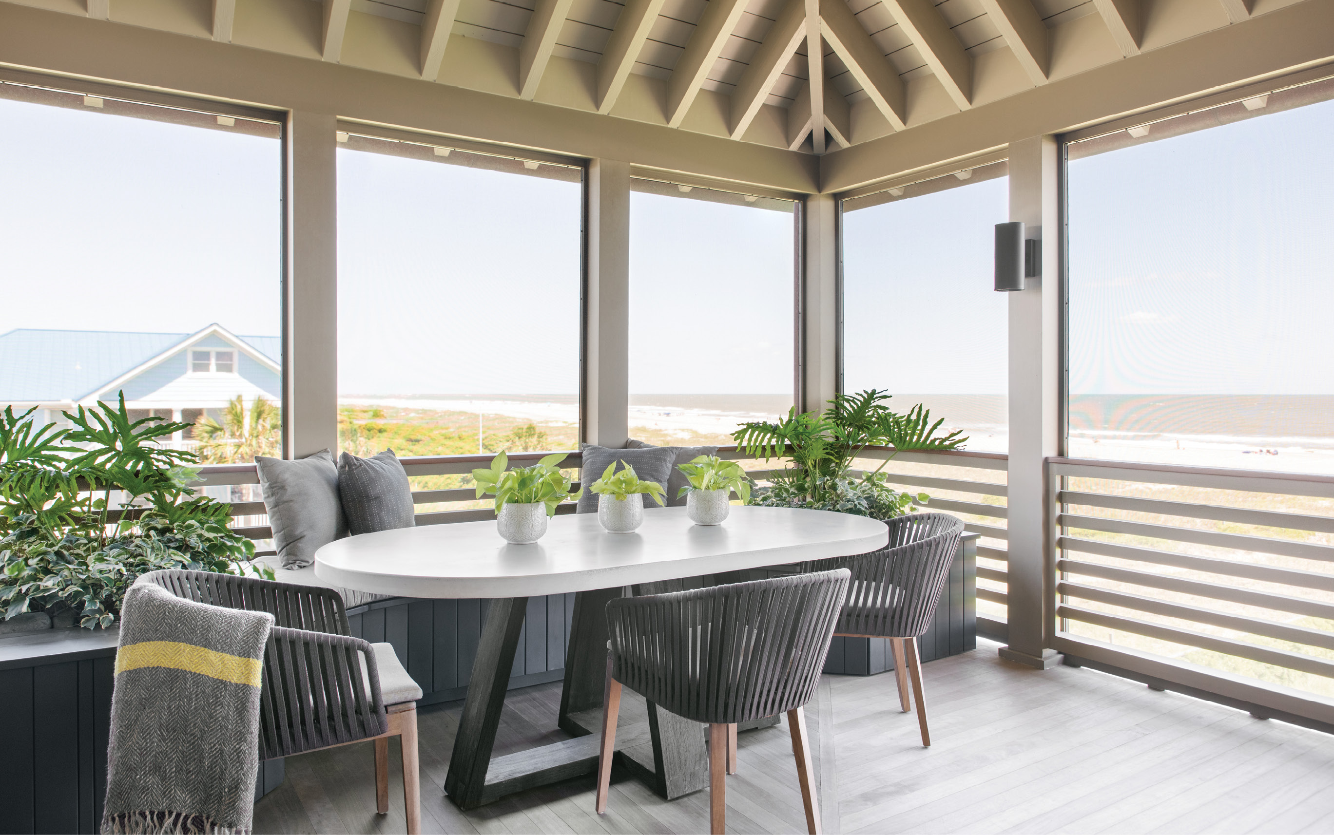
Viewfinder: With multiple porches, there’s always somewhere to sit and soak up the views. But the dining porch, complete with a custom oval concrete and elm table by Clubcu and JANUS et Cie Mood chairs, tops them all.
When Bishop proposed the idea, Dennis had serious doubts. “I said, ‘Oh, God. No way. Never,’” he recalls. “Having one room painted all in the same color—it was foreign to me.” But he and Joan went for it. “Now I can’t picture it any other way,” he laughs. The dark tone is offset by rows of windows and a brass chandelier featuring six white-glass pendants arranged asymmetrically over the table. The light fixture was a bit of a risk, “but the brass finish against the dark walls was a statement we were all excited about,” says Bishop. “The looping chandelier is like a piece of jewelry.”
Highlighted by that focal-point granite fireplace surround, the living room joins the kitchen in capturing the most spectacular beach panoramas. “I wanted all windows,” says Joan. “The builder, Rus Sheppard of Sheppard Construction, said to me, ‘Joan, you’re building a glass house.’ Why not take advantage of all the view we can?”
For that reason, the kitchen has no upper cabinets on the ocean side—just vistas of sand, water, and blue skies. Ingeniously, one window slides entirely behind the tiled backsplash above the Miele oven, creating an easy pass-through to the screened-in dining porch, which is the couple’s favorite space for cozy meals.
The master bedroom caps off the upper floor at the southern tip of the home. These calming quarters are awash in blue-green hues. “We took a chance in here with the wallpaper and the ceiling,” says Joan of the textured seagrass walls and painted ceiling. A geometric wooden chandelier and dazzling gold mirror add touches of warm color, while a classic Eames lounge chair provides a place to sit and soak up the views.
In another clever move, Clowney created a bit of office space for Joan—a small, built-in desk—in the hallway leading to the master bath and closet area. And the homeowners can step from their private retreat onto one of the porches that run the length of the house, with multiple outdoor stairways allowing for traversal up and down.
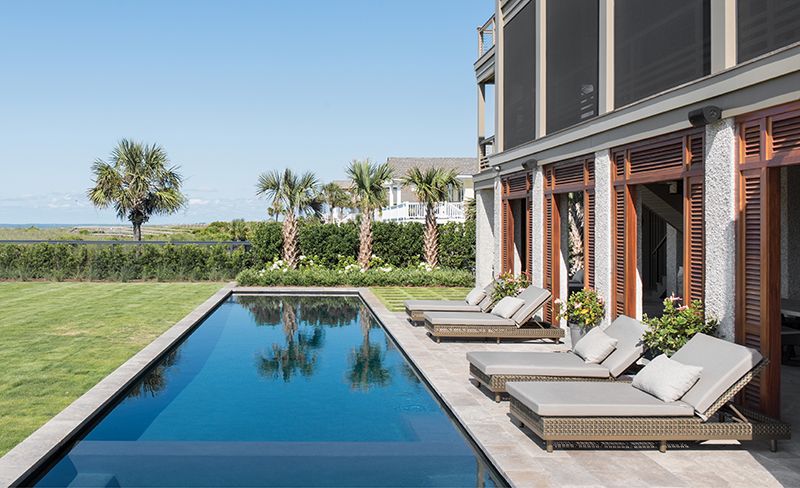
“All of these porches, all of these different places to go, are among the things that we love about the design,” says Dennis. And there are more alfresco areas, still: Below the first story is an ocean-facing lounge area complete with an open-air kitchen, where family and friends often gather.
Come weekend mornings, Dennis loves to sit in the spa at the end of the pool and watch football on the outdoor TV, while Joan soaks up the scenery in one of the lush garden rooms created by landscape architect Sheila Wertimer of Wertimer + Cline. “You can just go from one spot to another and there’s always something different,” Dennis says. “Even three years later, there’s always something new to see.”