Howard looked to her family’s collection of Asian antiques to inspire the home’s color palette and design

Around the time the Constitution was ratified and George Washington was sworn into his first term as president, a prosperous Charleston tanner named Jacob Williman built this handsome single house just north of Colonial Lake. Nearly two and a half centuries later, bold cherry-red piazza doors are the only outward indication that something more unique awaits beyond the modest-looking 18th-century façade, a hybrid of the Georgian and Federal architectural styles popular at the time of construction.
The Williman House’s current stewards—Gene and Elizabeth Howard, who are responsible for bringing the house into the 21st century—lived next door for six years before they purchased the aging home in 1998, which meant they were privy to more of its secrets than the average passerby. Most notable was the sprawling garden, which runs nearly the depth of the block.
“Our kids were little, and they’d always look out the dining room window,” Elizabeth says of her two children, Alexandra and Max. “There was this big inviting yard, and we just had a tiny courtyard.” What the kids saw as room to roam and play inspired Gene to replicate the lush tropical gardens of his childhood in the Philippines, where his grandfather was a missionary and his father, a practicing malariologist.

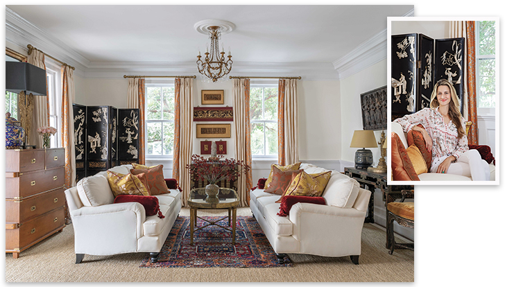
Designer Alexandra Howard (pictured inset) looked to her family’s collection of Asian antiques and artifacts to define the look and feel of this sitting room. A set of framed Indian sandalwood friezes and a trio of Chinese bas-reliefs inspired its rich red-and-gold color palette.
In 2000, following an update of the historical quarters, the Howards commissioned Charleston-based architect Beau Clowney to design a rear wing that doubled the square-footage of the house without altering the home’s centuries-old profile. (The addition is completely invisible from the street.) Inside, the transition from old to new is just as seamless with Clowney incorporating period materials and other appropriate design elements, such as the reclaimed pine boards Gene sourced from a barn in Connecticut that are a near match to the existing floors. The scale of the two-story addition, which includes a kitchen, casual living room, owners’ suite, small library, and screened porch, is more contemporary and designed in step with the rhythms of modern family life. In the Howards’s case, this meant adding open spaces and increasing natural light. Clowney achieved both by orienting the rooms toward the surrounding garden, which Gene and daughter, Alexandra, have spent the past few years transforming into the lush oasis he first imagined. Exotic oversized banana trees, various species of bamboo, castor plants, and Mexican honeysuckle mingle with Charleston standards like towering magnolias. The overall effect is that of a sophisticated adult tree house—serene rooms flooded with greenery and light.
At the time Jacob Williman built the original home, goods from India, China, and other Asian ports—especially textiles and tableware—were commonplace inside prosperous Charleston households. But, like the garden, the Howards’s gallery-worthy collection of Indian and Southeast Asian antiques and textiles isn’t part of a larger cultural story, but instead, reflects three generations of personal family history. Gene was born in India and spent part of his childhood in Manila, where his parents and grandparents worked as missionaries and doctors for long intervals. Alexandra, an interior designer now based in Charleston and New York, grew up surrounded by these family heirlooms. In 2018, when her parents enlisted her help to give the home a design reboot nearly two decades after the original renovation, the collection formed the backbone of her vision—one that highlights the antiques and artifacts without feeling like a museum.
“I was very fortunate that [my parents] had a lot of beautiful antiques to use as a starting point.... I stripped away all of the things that were not sentimental to the family.... Then I reviewed the basic elements. These remaining items, integral to each room, reinforced the color schemes and design.” —Alexandra Howard, interior designer
“I was very fortunate that [my parents] had a lot of beautiful antiques to use as a starting point,” Alexandra says. “So I stripped away all of the things that were not sentimental to the family, things that were purchased when we were young and intended for us to damage as kids. Then I reviewed the basic elements. These remaining items, integral to each room, reinforced the color schemes and design.”
In the original formal sitting room at the front of the house, for instance, a pair of Indian sandalwood friezes and a trio of Chinese bas-reliefs are framed in a deep red and gold. An antique Korean chest, which sits underneath the grouping, has a matching tassel. “These pieces informed the color of the room,” says Alexandra, who also brought in vibrant orange hues and touches of deep indigo. A pair of Anglo-Indian campaign chests, a rice paper temple rubbing from Angkor Wat, and an inlaid Chinese screen round out the room’s collection.
New rugs, including a custom-cut sisal rug lined in velvet and an antique oriental, pull together the room’s warm tones and cooler blue elements. Other textiles, like pillows designed by Alexandra, soften the formal space. Dated lighting had to go, so Alexandra chose new fixtures and worked with artisans at the American College of the Building Arts to create plaster medallions—both here and in the adjacent dining room—that even the most careful observer would be hard pressed to tell weren’t original to the 18th-century home.

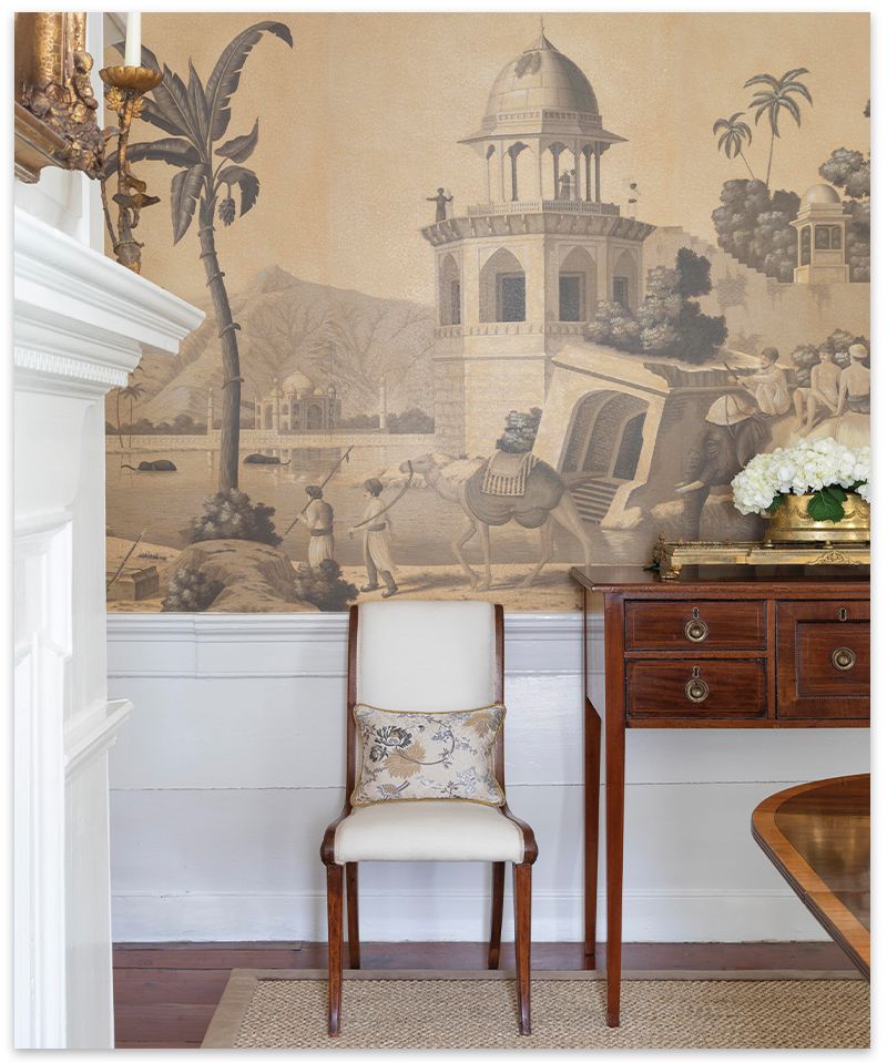
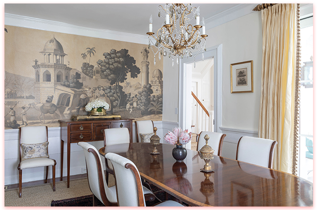
In the 18th-century home’s narrow dining room, one wall covered in custom panels of de Gournay’s “Early Views of India” wallpaper is the scene stealer.
The dining room’s unique architectural details, including a curious offset Georgian fireplace and railroad track-like dimensions, defined the look and feel of that adjoining space for Alexandra. But it wasn’t until she happened upon a surprisingly narrow dining room table, one that could also be extended the length of the room to accommodate larger parties, that the design really came together.
Custom panels of de Gournay’s “Early Scenes of India,” which have been dipped in tea to give them a warm sepia effect, give the small space its impactful moment. It’s a less-is-more technique she employed throughout the house—whether it’s the ornate Japanese screen on the wall of an upstairs guest bedroom or the custom Gracie wallpaper Alexandra designed for her parents’ peaceful bedroom suite, where a calming neutral color palette stands in contrast to the rest of the home’s rich jewel tones. “I believe in everything in moderation,” she says. “I didn’t cover every wall in those rooms, just one wall, because I think it makes more of an impact. You lose the fascination with the paper otherwise because it doesn’t feel as special.”
There’s an unexpected practicality to Alexandra’s sophisticated designs, where beauty and thoughtful lifestyle details successfully coexist. Think made-to-measure, double-sided pillows fronted with sumptuous antique textile remnants or luxe artisan fabrics and backed with a durable cotton velvet like those in the casual family room. On rainy afternoons, the family can throw open the floor-to-ceiling French doors leading to the screened porch and garden beyond, flip over a pillow, and curl up on the cozy linen-covered couch with a good book or settle in for a nap. “You feel like you can really relax,” without worrying about harming the beautiful fabrics, she says.
In the revamped kitchen, Alexandra added a cleverly concealed coffee bar, but even in this functional everyday space, common-sense design meets personal style and individuality. Alongside all the contemporary coffee accouterments hides Elizabeth’s prized collection of Moroccan teapots. “Most of all I want my clients to feel listened to,” Alexandra says. Even, or perhaps especially, when the clients are her parents.

How to Incorporate Family Heirlooms
Designer Alexandra Howard shares tips for mixing personal collections and inherited antiques into your space to add soul and style
Audit & Edit
You don’t need to use a piece just because your grandmother gave it to you. Hang on to the things you truly love. But Alexandra admits, letting go can be hard, and sometimes the perspective of an informed outsider, like a designer, can help. “I always review any personal collections with the clients,” she says. “Learning the history and significance of the pieces can help them decide to catalog and store certain ones while incorporating others into the overall design scheme.”
Consider Function
Choosing items that are both beautiful and useful makes incorporating them easy. “Define a room’s layout and utilize heritage pieces that offer both form and function, for example, trunks, bureaus, cabinets, tables, or chests,” Alexandra says.
Think Like a Curator
“Group items together, as opposed to all over a room,” Alexandra says. “This creates a collectible moment that showcases family heirlooms in an organized, focused way.” Alternately, if there’s a particularly treasured piece, honor it. “Give it pride of placement on a prominent wall or in the heart of a room’s design.”