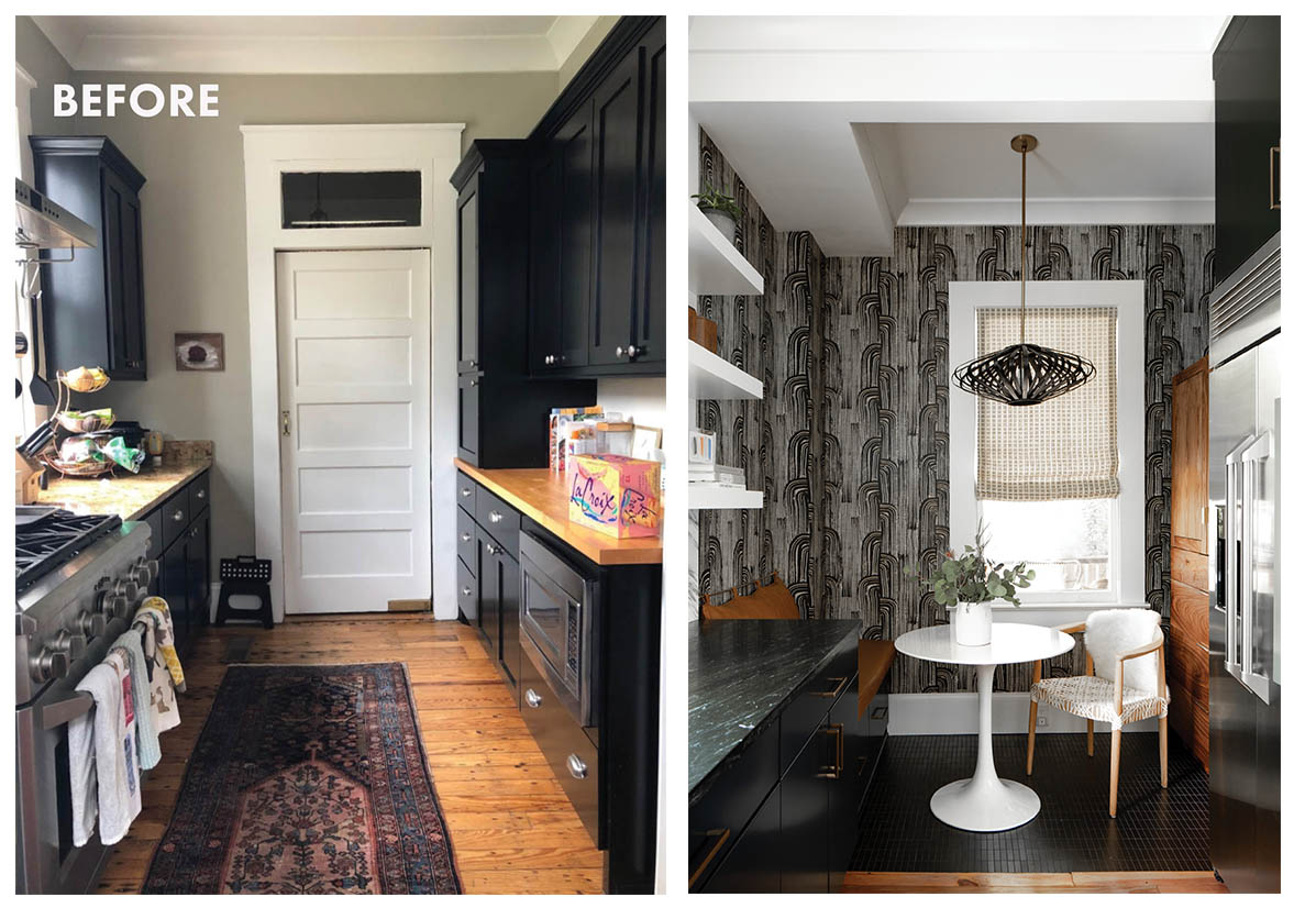
Yin & Yang: A bent bamboo pendant, inspired by a traditional Chinese lantern, sets the tone for this sophisticated space. Warm woods, in the form of a walnut cabinet and original flooring, soften the sleek stainless appliances and striking black cabinets.
A century-old home in Wagener Terrace gets a stylish modern kitchen that fits like a glove
Written By Jennifer Pattison Tuohy
Photographs By AIR Design Photography & courtesy of Becca Jones Interiors
This historic home in downtown Charleston needed some TLC. The homeowners, a young family who loves to cook, wanted a kitchen that was more workable and used the square footage to its fullest potential. Designer Becca Jones, owner of Becca Jones Interiors, stepped in to help turn the space from flawed to functional, adding a 50-square-foot breakfast nook while maintaining some of the existing charm (original hardwood flooring) and marrying it with the owners’ chic, eclectic style.
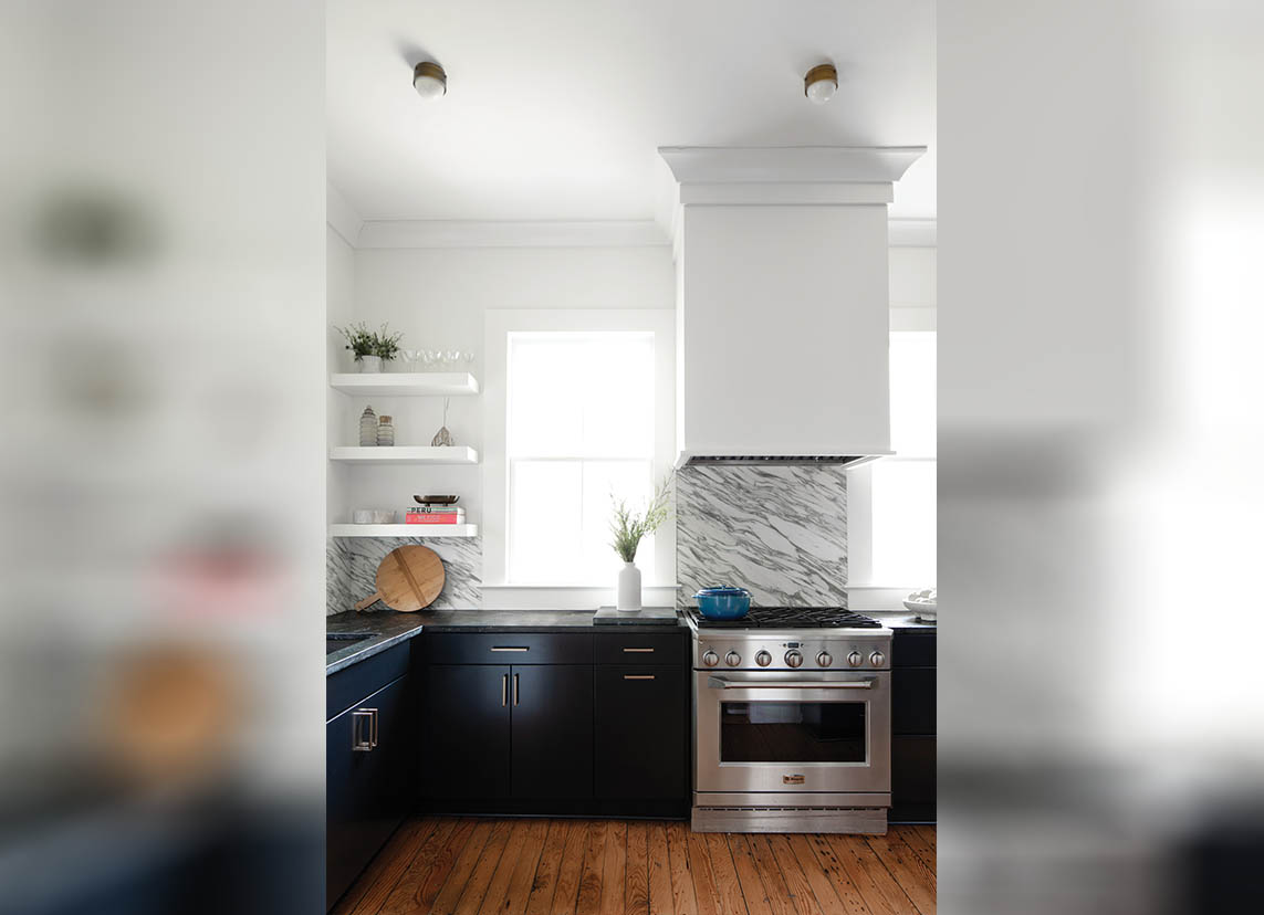
This meant an entire kitchen renovation, taking it down to its 1915 bones and starting from scratch. The result looks completely different yet retains the sense that it’s always been there. “I wanted it to feel like it belonged in the home, not like it was an afterthought,” says Jones. She retained the striking monochromatic palette while adding some organic touches and updating the cabinetry to extend to the ceiling for more storage. New, sleek hardware lends a more modern look and a stunning marble backsplash ties in the pattern play Jones introduced with the eyecatching Kelly Wearstler wallpaper.
But the biggest change was removing the existing walk-in pantry and replacing it with a cozy breakfast nook complete with a built-in banquette and mid-century modern tulip table. “I appreciated the clients’ willingness to take some risks,” says Jones. “We wanted the design to pack a punch.”The abundance of style in this small space makes it a showpiece where once were just shelves. From the wallpaper to the black stacked tile to the gorgeous pendant light fixture, and sleek, freestanding walnut pantry, this is a spot to sit in and stay a while.

KEY CHANGES
1. DINE IN
Removed the walk-in pantry to create a breakfast nook with a built-in banquette.
2. STONE FACED
Added a marble backsplash to complement new soapstone countertops.
3. SLEEK STORAGE
New cabinetry extends to the ceiling with updated hardware.
4. TOP SHELF
Swapped some cabinets with shelving for a more open feel.
5. DRAMATIC EFFECT
Created a sophisticated backdrop with a dramatic Kelly Wearstler wallpaper and black stacked-tile flooring.