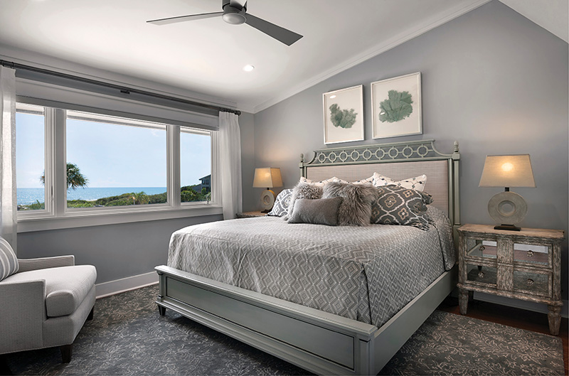
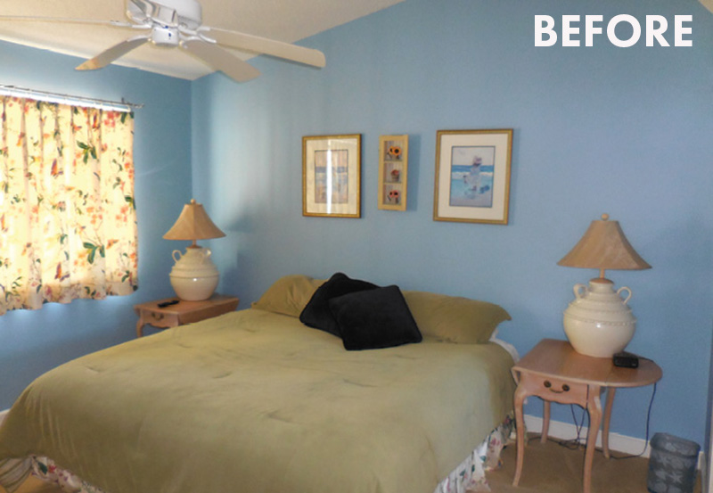
Palette Pleaser: Switching the color scheme from bright blue and yellow to soothing grays, silvers, and greens instantly updated the space and created a calm environment for guests.
A Pawley’s Island guest suite gets a thoughtful makeover with a soothing color palette and custom bedding
Written By Jennifer Pattison Tuohy
Photographs By Matt Silk & courtesy of CHD Interiors
A beach house is always going to attract visitors, and this one has seen its fair share, having been in one family for two generations. So, when it came time to update the four-bedroom, oceanfront home, the owners were keen to make the guest rooms as memorable and special as the rest of the house. They worked with interior designer Julie Schettig of CHD Interiors in Mount Pleasant to achieve this goal. “Because the home is so meaningful, it was important to renovate and update this space with those memories in mind,” says Schettig.
The main direction for this guest room was to make it one where visitors will feel “at home and on vacation” at the same time. Schettig first established a more sophisticated color scheme, featuring Sherwin-Williams “Samovar Silver,” and added seating as well as storage with the two nightstands from Bliss Studio. Existing art was grouped on a side wall for nostalgia, while updated elements, such as the abstract artwork above the bed and new lamps, complement the custom bedding from Fabricut, Century, and Krave.
KEY CHANGES
1. SET THE TONE
Switched the color scheme from bright blue and yellow to soft grays and greens for a peaceful feel.
2. CREATURE COMFORTS
Updated all the bedding and fabric for a more cohesive look.
3. FRAME THE VIEW
Added sheer drapes to allow for views with a touch of privacy.
4. HAUTE SEAT
Created a sitting area for added comfort.
5. BLEND IN
Selected new art to complement the design and not compete with existing family pieces.